
by AmyC | Jun 25, 2025 | Branding
A logo is just the beginning.In this post, we break down what brand strategy really means, why it matters, and how it turns visuals into something that connects, converts, and lasts. If you’re ready to build a brand with purpose, start here. A lot of people come to us...

by AmyC | Jan 6, 2025 | Branding, Digital Marketing, Email Marketing, Email Marketing, Root & Roam Blog, SEO, Social Media
TABLE OF CONTENTS $ Understanding Brand Authority $ The Foundation of Brand Authority–Quality Content $ Demonstrating Expertise and Thought Leadership $ Consistency and Frequency in Content Production $ SEO and Content Distribution $ Engaging with Your Audience $...

by AmyC | Aug 2, 2024 | Branding, Creative Services, Package Desgin, Root & Roam Blog
Your product’s packaging is more than just a container—it’s your first chance to capture attention, communicate value, and build trust. First impressions matter, and package design can be the deciding factor in whether customers reach for your product or move on....
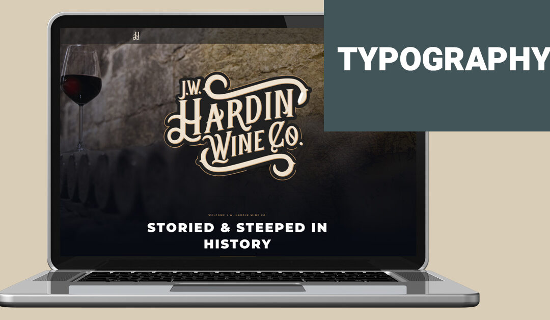
by Daron | May 4, 2023 | Branding, Graphic Design, Website
At Root & Roam Integrated Marketing Agency, typography is a fundamental element of our work. It’s the art and technique of arranging type, or text, to create visually-appealing and easy-to-read designs. In this blog post, we’ll take you through the...

by Daron | Apr 5, 2023 | Branding, Graphic Design, Website
In today’s world, staying ahead of design trends is a crucial part of building a successful brand. With new technologies and changing business landscapes, design is constantly evolving. Root and Roam Integrated Marketing Agency is committed to keeping up with...

by AmyC | Mar 11, 2022 | Branding, Uncategorized
Table of Contents $ What is branding? $ Why does branding matter? $ What are the elements of branding? When you hear the word, “brand,” what comes to mind? The name of a company? A logo? Many business owners spend very little time creating a meaningful brand and...