Typography—A Creative’s Guide to the Art of Arranging Text

Typography—A Creative’s Guide to the Art of Arranging Text

At Root & Roam Integrated Marketing Agency, typography is a fundamental element of our work. It’s the art and technique of arranging type, or text, to create visually-appealing and easy-to-read designs. In this blog post, we’ll take you through the history of typography, its importance in web design, the benefits of hierarchy, and five basic typography rules that we follow.

TABLE OF CONTENTS

$

A Brief History of Typography

$

Typography and Fonts on the Internet

$

The Benefit of Hierarchy

$

Five Basic Typography Rules

$

Get the Most Out of Your Typography

A Brief History of Typography

The history of typography dates back to the invention of writing itself. As researchers have seen, the earliest typefaces were carved into stone or wood and later printed using movable type. With the invention of the printing press, typography changed the way books were produced, making them more accessible and affordable to the masses.

Typography and Fonts on the Internet

We never overlook the importance of typography in website design. Choosing the right font for a website can greatly affect its readability and usability. With the internet, we have access to a vast array of fonts and typefaces, but we must also consider the legibility of the font on different devices and screen sizes. At Root & Roam, we carefully select fonts that are visually appealing and easy to read on all devices.

The Benefit of Hierarchy

Hierarchy (elements that show importance in the design as a whole such as color, contrast, and alignment),  is a critical element in typography, and it’s essential to consider when designing. It helps the reader navigate and understand the content. We use hierarchy to enhance the visual appeal of our designs and to improve the readability of the text. We achieve this by using different font sizes, weights, and colors to create a visual hierarchy.

Five Basic Typography Rules

The designers here at Root & Roam follow these five basic typography rules to create visually-appealing and easy-to-read designs:

1. Use readable fonts. It’s important to choose fonts that are easy to read, especially for long blocks of text.

2. Limit the number of fonts. To create a cohesive look, it’s best to stick to one or two fonts.

3. Use appropriate font sizes. Different font sizes create a visual hierarchy and improve readability.

4. Use appropriate font weights. Bold or italic fonts can be used to emphasize important text.

5. Use appropriate line spacing. Sufficient line spacing improves legibility and readability.

Get the Most Out of Your Typography

Typography is a critical element of our design process. By understanding the history of typography, its importance in web design, the benefits of hierarchy, and by following basic typography rules, we create visually-appealing and easy-to-read designs. Typography is an art, and we pride ourselves in our ability to make written language legible, readable, and appealing when displayed.

Design Trends for 2023-A Look into the Future

Design Trends for 2023-A Look into the Future

In today’s world, staying ahead of design trends is a crucial part of building a successful brand. With new technologies and changing business landscapes, design is constantly evolving. Root and Roam Integrated Marketing Agency is committed to keeping up with the latest trends to ensure our clients stay ahead of the competition. In this blog post, we’ll take a look at some of the design trends we expect to see in 2023.

TABLE OF CONTENTS

$

Minimalism

$

Bold Colors

$

3D Design

$

Augmented Reality

$

Looking To The Future

Minimalism

Minimalism has been a popular design trend for several years now, and we expect it to continue this year. The use of simple, clean lines and minimal color palettes can create a modern, sophisticated look that appeals to consumers. Brands like Apple and Google have successfully incorporated minimalism into their branding and marketing, using clean, uncluttered designs to communicate their messages.

Bold Colors

Another trend we expect to see in 2023 is the use of bold, vibrant colors. Bright, eye-catching hues can make a brand stand out and grab the attention of potential customers. Brands like Coca-Cola and Airbnb have used bold colors effectively in their branding and marketing, creating a memorable visual identity that sticks in consumers’ minds.

3D Design

Advancements in technology have led to the growing popularity of 3D design and AI. 3D design can be used to create more immersive, engaging marketing materials, such as product animations and interactive websites. Brands like Nike and Mercedes-Benz have used 3D design to create stunning, memorable marketing campaigns that capture the attention of consumers.

Augmented Reality

Augmented reality (AR) is another trend. AR can be used to create interactive experiences for consumers, allowing them to engage with a brand in a new and exciting way. Brands like Ikea and Sephora have successfully incorporated AR into their marketing, using it to create engaging and unforgettable experiences for their customers.

Looking to the Future

As we look to the future, it’s clear that design will continue to play a crucial role in building successful brands. By staying up-to-date with the latest trends, businesses can ensure that they’re communicating their messages effectively and engaging with their target audiences. At Root and Roam Integrated Marketing Agency, we’re committed to helping our clients stay ahead of the curve. Contact us today to learn more about how we can help you build a strong, effective brand that stands out in a crowded marketplace.

The History of Marketing

The History of Marketing

The history of marketing – Marketing is defined as the action of promoting and selling products or services. For as long as there has been something to trade, barter, or sell, there has also been marketing. From the first example of branded materials to the invention of the printing press to modern technology, let’s take a trip through time and discover the history of marketing.

The_history_of_marketing, The history of marketing goes back thousands of years. In this image, we explore the history of marketing from 1450 (the first appearance of printed advertising) to the more recent boom of social media in the early 2000s-2010s. This timeline of marketing history takes you through the major events that made the industry what it is today.

Looking Forward

As we step into the new year, marketing looks a bit different than it did 200 years ago. Cutting-edge technology and business practices, coupled with new consumer habits, require brands to step up with new marketing techniques in 2022. Forbes magazine predicts that this year consumers will be more inclined to purchase a brand than a product. Buyers want to do business with brands that share their values. Forbes also predicts that consumers will prefer to be taught, rather than sold on the ethics of a business. They understand that company X may have the best customer service around, but they are looking for companies to educate them on their biggest questions.

Why Adobe Libraries is a Key Feature for Designers

Why Adobe Libraries is a Key Feature for Designers

Why Adobe Libraries is a Key Feature for Designers Designers often need to maintain consistency across different projects and brands, using the same graphics, colors, fonts and vector graphics. But, before Adobe Libraries came along, there was no easy way to store all of these elements in one convenient place. The library feature allows designers to easily create templates that can be accessed from anywhere within the Adobe Creative Cloud and used in any of the applications it supports. In this article, we’ll examine the benefits of using Adobe Libraries and why it’s so important for graphic designers of all levels who use the Adobe Creative Cloud suite of tools.

TABLE OF CONTENTS

$

What are Libraries

$

How Do They Work

$

What Can I Put Into a Library

$

How Do I Use a Library?

What Are libraries?

Adobe Libraries is a panel within your Creative Cloud account where you can store your design elements. These may be graphics, colors, fonts or vector graphics and images. When you add content to a library, it becomes available across all of your Adobe products that support Libraries and to anyone who has access. So when I create an element in Adobe InDesign, you can then access that object in Illustrator or Photoshop because they share my Creative Cloud libraries.

How Do They Work?

Adobe libraries are a great way to organize all of your assets, whether they are in Adobe products or not. The library links the element and allows you to access it from the Cloud quickly. This gives you access to them faster and easier with less effort, while helping you and your team stay organized. You can organize by any folder structure or by automatic groups that typically group by colors, vector graphics, images, character styles.

What Can I Put Into an Adobe library?

The good news is that you can put almost anything into an Adobe library. The bad news is, well, there isn’t any bad news!

How Do I Use a Library?

You can simply drag an asset into the library panel from whatever program you are working in. Once you save an element into your library, it will automatically sync with Creative Cloud, allowing access anywhere there is internet connection. Using Adobe Libraries simplifies brand consistency by keeping artwork items consistent from one project to another.

Adobe Libraries is an awesome tool for our team. We are still learning our favorite perks from this Adobe tool.

Below are the top 5 reasons I love to use Adobe Libraries.

1. Togetherness—Keeping all our brand assets together has always been a challenge. Having one library that our whole team can access is key. Having one place to store and use universal graphics is super handy. Whether we’re working on an email, project brief or website, it’s all right there in one place. No more hunting through emails and files to find that brand asset you need. With Adobe Libraries, you can search by type of file or artwork (vector graphics, colors and fonts) across your library. That means everyone always has access to all assets they may need while designing and creating projects. In addition to giving us a place to store and use our brand assets, it gives us guidance when we’re designing new pieces of work. We use Adobe Libraries as inspiration during concepting phases of projects.

2. Web, Print, and More—The constant growth of channels and tools keeps our head spinning. Adobe Libraries can access any of the Adobe programs, so we can easily utilize any output needed. Combining all of these platforms gives us a library that is limitless with opportunities and options to create beautiful art pieces! Also, it organizes our projects, making them easier to find—a designer’s dream! Efficiency at its finest.

3. Logo changes—You can make universal changes, and if linked correctly, the change will apply anywhere you use the library element. If you use the library element by dragging it into the document you are working on, an icon appears in the top left letting you know it is linked.  If you have a change to make on the linked graphic or image, you can double click on the library element, make your change in its native environment, then save.  That change is then made anywhere that graphic was linked.

4. Color consistency—Sometimes a color will change in the branding, and we never know where the new color originated.  Having a library of colors across all Adobe apps allows all users to apply color with confidence.

To save a color in your library, follow these steps: 

          • Click on + at top left of window. 
          • Click on New Color Swatch. 
          • Fill in name (optional) and hex value. 
          • You can also add RGB or CMYK values. 
          • Confirm & click Add.

5. Organization—Adobe Libraries makes it easy to rename artwork and organize it in a visual way. I love how it will create groups for you, including Colors, Typography, Vector Graphics, and Images, so you can quickly identify what you need.

You can create an Abode library and organize your most used elements in a way that makes sense to you. You can customize colors, fonts, images and graphics using your library icons, so they’re easy to locate when working on projects. Since everything is linked, changes to one element will be updated across all documents where it appears, ensuring consistency of style throughout your work. Organizing elements visually in libraries also helps reduce errors by helping you find what you need faster and allowing more room for creativity. If everything looks good visually, then it will look good design-wise too. Adobe Libraries also helps manage large amounts of content—especially color swatches.

    Adobe Creative Cloud and Adobe Libraries are robust tools. We at Root & Roam are constantly using Adobe to improve our collaboration and teamwork. We find these tools help us become more efficient and consistent. Below are a couple of links that we find interesting from Adobe. 


    https://www.adobe.com/content/dam/acom/en/products/creativecloud/business/enterprise/pdfs/productivity-gains-of-using-creative-cloud-libraries.pdf


    https://www.adobe.com/creativecloud/libraries.html

    Choosing a Graphic Designer

    Choosing a Graphic Designer

    Choosing a Graphic Designer Quality graphic design is a vital element of your business. A quality graphic designer can help your company’s visibility, sophistication, efficiency, and desirability over the competition. It is essential to stand out effectively with your products and services in the marketplace, so it is essential to choose a quality graphic designer who can meet your needs.

    5 factors to consider when choosing a graphic designer

    1. Skills

    It is important that the graphic designer is on top of the latest design, marketing, and Web trends. Knowledge is power, and a quality graphic designer will be able to apply their knowledge to help your company succeed. Another element in their skill set should be efficiency in the latest design software. The more efficient and knowledgeable they are in these programs, the more confident you can be, knowing they are using the best software to create great designs.

    2. Experience

    No matter if you are choosing a freelancer or design firm, industry experience is also important. A reputable graphic designer will always be up to speed on the latest strategies and best practices. A quality graphic designer or firm should be able to present their work experience to you. This can come in the form of a presentation of their portfolio or customer testimonials.

    3. Portfolio

    A strong portfolio can give you an idea of the designer’s sense of style, capabilities, and whether they are a good fit for the projects you need. Look for work that shows freshness, creativity, and attention to detail.

    4. References

    If a designer is able to provide you with references or testimonials from clients they have worked with successfully, this is a good indicator of a positive attitude and dedication to presenting quality, professional design to your business.

    5. Personality/Professionalism

    A quality graphic designer will take pride in the relationships they form with a client. They should be responsive, knowledgeable, and active listeners. You should get a good sense that they are on your team, consistent, and are understandable to your company’s vision.

    Not all designers are created equal. With these five factors, choosing a quality graphic designer can be a long, but worthwhile, process. Adding a quality graphic designer to your design and marketing efforts will not only improve your brand identity but will also help you stand out against the competition.

      RGB vs CMYK : What is the difference?

      RGB vs CMYK : What is the difference?

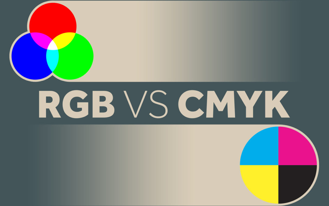
      RGB vs CMYK – What is the difference between RGB and CMYK? Simply put, it’s just different ways of processing colors. Painters mix paint to make the perfect color palette. Digital designers also mix colors to create palettes, photography, and more. CMYK is the process of mixing 4 basic colors, Cyan, Magenta, Yellow, and Black, to make thousands of colors and realistic images in the printing process. RGB is the process of mixing three basic colors along with light, Red, Green, and Blue. The RGB color process was invented in the digital process when we started using televisions, computers, and retina displays.

      RGB is an additive color model that uses Red, Green, Blue, and light for screens and monitors. CMYK is a subtractive color model used for printing made of four colors: Cyan, Magenta, Yellow, and Black. Black is the key color that provides the detail. That is where we get the K in CMYK.

      Check out this graphic from our friends at Visual Pro:

      rgb vs cmyk

      The RGB process has made a huge splash in the design world now that we have retina displays at our fingertips that can interpret millions of colors. The technology is changing so quickly, but it is important to know the basic concept and why.

      The timeline of RGB actually dates back before the electronic age and has roots in photography. But it made its debut with desktop computers in the 70’s displaying an amazing palette of 16 colors. RGB made its next splash with 24-bit monitors and then again with HTML with its 24bit color palette. Now our monitors and phones can interpret millions of colors with RGB.

      What is RGB?

      RGB is an acronym for Red Green Blue. Based on these three colors plus light, you can create a spectrum of colors. This color combination plus millions of tiny lights allows us to see images on digital items, such as televisions, projection systems, computers, and cell phones. RGB has advanced so rapidly with displays that we can now see millions of colors, just by applying a combination of Red, Green, and Blue.

      Why should you care? Using the wrong color settings can cause your print projects to come out too dark or your website images to appear muddy and non-vibrant. RGB and CMYK are settings in most design programs that interpret the colors for us. Designers build graphics based on the end product and adjust settings to make your project perfect. If your end goal is digital, keep it RGB, but if you are looking to get something printed, you may want to change your mode to CMYK.

      What is CMYK?

      CMYK is a combination of 4 transparent colors; (c)yan, (m)agenta, (y)ellow, and blac(k). The K stands for “Key” – This is always black ink and helps finalize the details. This process is actually pretty awesome, and if you ever get to go to a printing press that uses CMYK plates, it’s an interesting process to watch. The printing press makes 4 plates (Cyan, Magenta, Yellow, and Black). Ink is then applied to each plate and paper runs through the press perfectly lining up to make a final image.

      Check out this graphic from Printing Solutions:

      cmyk or rgb for print

      It doesn’t feel possible that combining those four colors would produce such a vivid image of color, but it does. Magic… science… same thing.

      We use CMYK for the printing process. This is how the ink is distributed on our inkjet home printers and our large 4 color press printers. Same theory.

      If the final destination of your graphic is not printed, this setting can make your color look a little muddy or not as vibrant. If it is really important that the color is exact for you, you will want to have a designer with a calibrated monitor help or do some test prints from the printer.

      Hex Codes and Web Safe Color

      Since not all monitors are the same, designing for the web can be tricky. Even if I use my RGB settings, things can differ based on the display type. Monitors and displays are constantly advancing also, but Hex codes are a way to keep your colors as consistent as possible. A hex code is a code of 6 letters and numbers that basically tell the monitor how to interpret the RGB color. Choosing web safe colors is still best practice to have consistency across displays, but this rule seems to have less value lately as most of the population have modern displays.

      This is a good reference for web safe hex values.

      One thing to note – make sure the numbers or letters are the same in each segment. This formula ensures that the color is going to be web safe. Like #CCFF00 is web safe because the numbers match up, while #CF01RR will not be as consistent across all displays.

      Hex Codes still interpret color in an additive RGB format; it is simply the code telling the website how much color to display.

      Color Blindness on the Web

      Because not every person sees things the same, we have to make sure content is still visible for our color blind friends and coworkers. Making sure your background and type have enough contrast is a good rule of thumb. Also, making sure that you don’t use certain colors on top of each other like red and green. Color combos and fancy backgrounds can be fun, but don’t forget websites are still a tool to deliver information. Check out this really cool tool that will help you make sure your site is color friendly.

      The difference between RGB and CMYK

      Here are the main things to keep in mind as you prepare graphics for output. CMYK setting is for print and is made of four colors in a subtractive color model like paint. RGB is a setting that uses light and an additive color model to make vibrant colors on our digital displays.

      Thanks for stopping by. The team at Root & Roam know some things about color, so if you are having trouble on a project, let Root & Roam help!