by Amy | Nov 8, 2021 | Photography, Root & Roam Blog
Holiday Food Styling – How to achieve the picture-perfect tablescape Holiday food styling guide. – The holidays are the most festive time of the year, but they can also be the most stressful. Here are some useful food styling tips for getting that...
by Amy | Oct 26, 2021 | Digital Marketing, Event Marketing, Public Relations, Root & Roam Blog, Traditional Marketing
TABLE OF CONTENTS $ Holiday Offer $ Holiday Marketing Goals $ Campaign Key Performance Indicators $ Holiday Marketing Campaign Target Audience and Personas $ Holiday Campaign Budget $ Holiday Marketing Action Items $ Get to Work On Your Marketing Plan $ Holiday...
by Amy | Sep 24, 2021 | Digital Advertising, Digital Marketing, Root & Roam Blog, Social Media
When putting together your social media strategy, you should always consider the tools available to help you meet your goals. A popular tool for over a decade has been the famous hashtag. Hashtags are powerful tools that can help your target audience find you...
by Amy | Sep 9, 2021 | Root & Roam Blog
What is Affiliate Marketing – Affiliate marketing can be a useful tool to expose your company to potential new customers while building brand loyalty and credibility. Oftentimes, affiliate marketing is overlooked because the process can seem overwhelming to many...
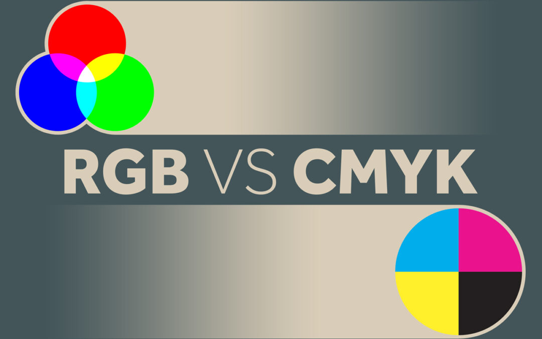
by Amy | Aug 20, 2021 | Branding, Creative Services, Digital Marketing, EDDM, Graphic Design, Root & Roam Blog, Website
RGB vs CMYK – What is the difference between RGB and CMYK? Simply put, it’s just different ways of processing colors. Painters mix paint to make the perfect color palette. Digital designers also mix colors to create palettes, photography, and more. CMYK is the...