Why Adobe Libraries is a Key Feature for Designers

Why Adobe Libraries is a Key Feature for Designers

Why Adobe Libraries is a Key Feature for Designers Designers often need to maintain consistency across different projects and brands, using the same graphics, colors, fonts and vector graphics. But, before Adobe Libraries came along, there was no easy way to store all of these elements in one convenient place. The library feature allows designers to easily create templates that can be accessed from anywhere within the Adobe Creative Cloud and used in any of the applications it supports. In this article, we’ll examine the benefits of using Adobe Libraries and why it’s so important for graphic designers of all levels who use the Adobe Creative Cloud suite of tools.

TABLE OF CONTENTS

$

What are Libraries

$

How Do They Work

$

What Can I Put Into a Library

$

How Do I Use a Library?

What Are libraries?

Adobe Libraries is a panel within your Creative Cloud account where you can store your design elements. These may be graphics, colors, fonts or vector graphics and images. When you add content to a library, it becomes available across all of your Adobe products that support Libraries and to anyone who has access. So when I create an element in Adobe InDesign, you can then access that object in Illustrator or Photoshop because they share my Creative Cloud libraries.

How Do They Work?

Adobe libraries are a great way to organize all of your assets, whether they are in Adobe products or not. The library links the element and allows you to access it from the Cloud quickly. This gives you access to them faster and easier with less effort, while helping you and your team stay organized. You can organize by any folder structure or by automatic groups that typically group by colors, vector graphics, images, character styles.

What Can I Put Into an Adobe library?

The good news is that you can put almost anything into an Adobe library. The bad news is, well, there isn’t any bad news!

How Do I Use a Library?

You can simply drag an asset into the library panel from whatever program you are working in. Once you save an element into your library, it will automatically sync with Creative Cloud, allowing access anywhere there is internet connection. Using Adobe Libraries simplifies brand consistency by keeping artwork items consistent from one project to another.

Adobe Libraries is an awesome tool for our team. We are still learning our favorite perks from this Adobe tool.

Below are the top 5 reasons I love to use Adobe Libraries.

1. Togetherness—Keeping all our brand assets together has always been a challenge. Having one library that our whole team can access is key. Having one place to store and use universal graphics is super handy. Whether we’re working on an email, project brief or website, it’s all right there in one place. No more hunting through emails and files to find that brand asset you need. With Adobe Libraries, you can search by type of file or artwork (vector graphics, colors and fonts) across your library. That means everyone always has access to all assets they may need while designing and creating projects. In addition to giving us a place to store and use our brand assets, it gives us guidance when we’re designing new pieces of work. We use Adobe Libraries as inspiration during concepting phases of projects.

2. Web, Print, and More—The constant growth of channels and tools keeps our head spinning. Adobe Libraries can access any of the Adobe programs, so we can easily utilize any output needed. Combining all of these platforms gives us a library that is limitless with opportunities and options to create beautiful art pieces! Also, it organizes our projects, making them easier to find—a designer’s dream! Efficiency at its finest.

3. Logo changes—You can make universal changes, and if linked correctly, the change will apply anywhere you use the library element. If you use the library element by dragging it into the document you are working on, an icon appears in the top left letting you know it is linked.  If you have a change to make on the linked graphic or image, you can double click on the library element, make your change in its native environment, then save.  That change is then made anywhere that graphic was linked.

4. Color consistency—Sometimes a color will change in the branding, and we never know where the new color originated.  Having a library of colors across all Adobe apps allows all users to apply color with confidence.

To save a color in your library, follow these steps: 

          • Click on + at top left of window. 
          • Click on New Color Swatch. 
          • Fill in name (optional) and hex value. 
          • You can also add RGB or CMYK values. 
          • Confirm & click Add.

5. Organization—Adobe Libraries makes it easy to rename artwork and organize it in a visual way. I love how it will create groups for you, including Colors, Typography, Vector Graphics, and Images, so you can quickly identify what you need.

You can create an Abode library and organize your most used elements in a way that makes sense to you. You can customize colors, fonts, images and graphics using your library icons, so they’re easy to locate when working on projects. Since everything is linked, changes to one element will be updated across all documents where it appears, ensuring consistency of style throughout your work. Organizing elements visually in libraries also helps reduce errors by helping you find what you need faster and allowing more room for creativity. If everything looks good visually, then it will look good design-wise too. Adobe Libraries also helps manage large amounts of content—especially color swatches.

    Adobe Creative Cloud and Adobe Libraries are robust tools. We at Root & Roam are constantly using Adobe to improve our collaboration and teamwork. We find these tools help us become more efficient and consistent. Below are a couple of links that we find interesting from Adobe. 


    https://www.adobe.com/content/dam/acom/en/products/creativecloud/business/enterprise/pdfs/productivity-gains-of-using-creative-cloud-libraries.pdf


    https://www.adobe.com/creativecloud/libraries.html

    RGB vs CMYK : What is the difference?

    RGB vs CMYK : What is the difference?

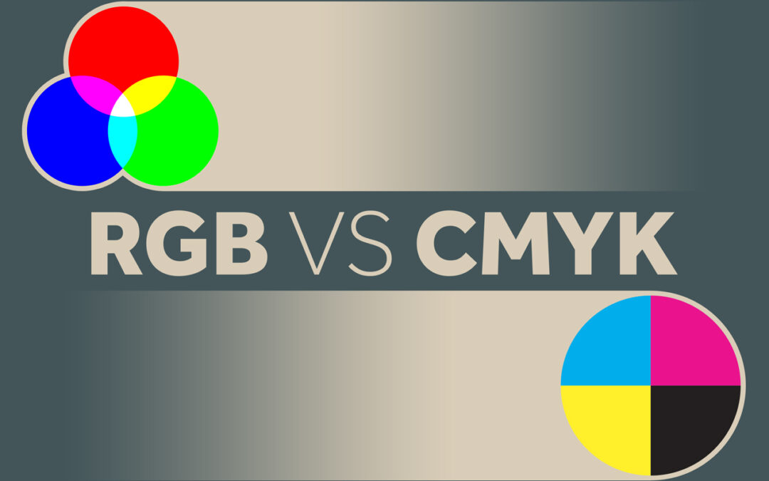
    RGB vs CMYK – What is the difference between RGB and CMYK? Simply put, it’s just different ways of processing colors. Painters mix paint to make the perfect color palette. Digital designers also mix colors to create palettes, photography, and more. CMYK is the process of mixing 4 basic colors, Cyan, Magenta, Yellow, and Black, to make thousands of colors and realistic images in the printing process. RGB is the process of mixing three basic colors along with light, Red, Green, and Blue. The RGB color process was invented in the digital process when we started using televisions, computers, and retina displays.

    RGB is an additive color model that uses Red, Green, Blue, and light for screens and monitors. CMYK is a subtractive color model used for printing made of four colors: Cyan, Magenta, Yellow, and Black. Black is the key color that provides the detail. That is where we get the K in CMYK.

    Check out this graphic from our friends at Visual Pro:

    rgb vs cmyk

    The RGB process has made a huge splash in the design world now that we have retina displays at our fingertips that can interpret millions of colors. The technology is changing so quickly, but it is important to know the basic concept and why.

    The timeline of RGB actually dates back before the electronic age and has roots in photography. But it made its debut with desktop computers in the 70’s displaying an amazing palette of 16 colors. RGB made its next splash with 24-bit monitors and then again with HTML with its 24bit color palette. Now our monitors and phones can interpret millions of colors with RGB.

    What is RGB?

    RGB is an acronym for Red Green Blue. Based on these three colors plus light, you can create a spectrum of colors. This color combination plus millions of tiny lights allows us to see images on digital items, such as televisions, projection systems, computers, and cell phones. RGB has advanced so rapidly with displays that we can now see millions of colors, just by applying a combination of Red, Green, and Blue.

    Why should you care? Using the wrong color settings can cause your print projects to come out too dark or your website images to appear muddy and non-vibrant. RGB and CMYK are settings in most design programs that interpret the colors for us. Designers build graphics based on the end product and adjust settings to make your project perfect. If your end goal is digital, keep it RGB, but if you are looking to get something printed, you may want to change your mode to CMYK.

    What is CMYK?

    CMYK is a combination of 4 transparent colors; (c)yan, (m)agenta, (y)ellow, and blac(k). The K stands for “Key” – This is always black ink and helps finalize the details. This process is actually pretty awesome, and if you ever get to go to a printing press that uses CMYK plates, it’s an interesting process to watch. The printing press makes 4 plates (Cyan, Magenta, Yellow, and Black). Ink is then applied to each plate and paper runs through the press perfectly lining up to make a final image.

    Check out this graphic from Printing Solutions:

    cmyk or rgb for print

    It doesn’t feel possible that combining those four colors would produce such a vivid image of color, but it does. Magic… science… same thing.

    We use CMYK for the printing process. This is how the ink is distributed on our inkjet home printers and our large 4 color press printers. Same theory.

    If the final destination of your graphic is not printed, this setting can make your color look a little muddy or not as vibrant. If it is really important that the color is exact for you, you will want to have a designer with a calibrated monitor help or do some test prints from the printer.

    Hex Codes and Web Safe Color

    Since not all monitors are the same, designing for the web can be tricky. Even if I use my RGB settings, things can differ based on the display type. Monitors and displays are constantly advancing also, but Hex codes are a way to keep your colors as consistent as possible. A hex code is a code of 6 letters and numbers that basically tell the monitor how to interpret the RGB color. Choosing web safe colors is still best practice to have consistency across displays, but this rule seems to have less value lately as most of the population have modern displays.

    This is a good reference for web safe hex values.

    One thing to note – make sure the numbers or letters are the same in each segment. This formula ensures that the color is going to be web safe. Like #CCFF00 is web safe because the numbers match up, while #CF01RR will not be as consistent across all displays.

    Hex Codes still interpret color in an additive RGB format; it is simply the code telling the website how much color to display.

    Color Blindness on the Web

    Because not every person sees things the same, we have to make sure content is still visible for our color blind friends and coworkers. Making sure your background and type have enough contrast is a good rule of thumb. Also, making sure that you don’t use certain colors on top of each other like red and green. Color combos and fancy backgrounds can be fun, but don’t forget websites are still a tool to deliver information. Check out this really cool tool that will help you make sure your site is color friendly.

    The difference between RGB and CMYK

    Here are the main things to keep in mind as you prepare graphics for output. CMYK setting is for print and is made of four colors in a subtractive color model like paint. RGB is a setting that uses light and an additive color model to make vibrant colors on our digital displays.

    Thanks for stopping by. The team at Root & Roam know some things about color, so if you are having trouble on a project, let Root & Roam help!

    Why Rebrand

    Why Rebrand

    Rebranding could be the difference between reaching your company’s full potential or being left behind. Staying ahead in any niche is a constant race. To keep your brand relevant, you need to be willing to do what it takes to make it stand out to consumers. A rebrand could be the answer to your needs. At Root & Roam, we recently went through the rebranding process to better fit our clients’ needs, and we are here to share our experience with you.

    What is branding?

    Let’s begin with what branding isn’t. Branding is not just the look and feel of your company. Nor is it a color palette or a tagline. Your brand is what draws people to purchase from you and not your competitors, and, if done correctly, creates an emotional tether between your brand and the consumer. For example, people don’t purchase a Mercedes for the look of the brand, but rather, the status owning a Mercedes provides to them. They want to “feel” special, luxurious, different, therefore, they choose that brand over others. 

    The look and feel of a brand is important, however, in that you want to stand out from your competition. As well, you want your brand to align with your products, services, and, most importantly, your vision and mission.

    What is rebranding?

    Rebranding is the strategy that aims at changing the perception of your brand by the consumer through a modification of your existing brand. During the rebranding process, your company’s assets are transformed (and possibly your positioning in the marketplace) into something fresh and relevant that will draw the attention of your target audience. Rebranding can be as simple as a color palette change or as extreme as a complete rehaul of your business model.

    The purpose of a rebrand

    Today, with so many brands competing within the same consumer space, it’s imperative that your brand stand out uniquely and sincerely. Consumers are becoming more conscious of what they consume and how brands relate to the world around them. Rebranding is a tool to remind buyers who you are and why your brand is their best choice.

    Have you ever noticed when multiple fast-food brands start to have similar storefront appearances? How about when cell phone companies offer similar services? What makes one burger joint better than another? What is so special about unlimited talk and text when everyone has it? That is where the little things come in to play, such as broader cell phone coverage or a special sauce that no one else has. That is the unique identifier that consumers are drawn to and purchase from. Rebranding is the chance to present your special sauce in a new way.

    The process

    We understand that rebranding can be a tricky process. That is why we have broken it down into an easy-to-follow six-step process.

    - 1 -

     Begin your rebrand with competitive analysis. Understanding what your competitors are doing, how they may be outperforming you, and identifying areas within the marketing landscape where you could compete will help you to define your goals.

    - 2 -

    Establish your goals. To ensure that you get everything you desire out of a rebrand, it is important to establish what you wish to achieve from the process. Some questions to ask include “who is your target audience?”, “Is there a new product or service to come with the rebranding?”, “Have your business values or company culture changed?”, and “What don’t you like about your current branding?”. The answers to these questions may provide a clear path to those goals. Be sure to leverage your competitive analysis when establishing goals.

    - 3 -

    Assign your rebranding team. You may choose to hire an agency, such as Root & Roam, or to establish an internal team for the job. The rebranding team should possess adequate market knowledge and skills to perform the rebranding tasks.

    - 4 -

    Develop a strategy. Before you begin putting things into action, we recommend creating a roadmap of how you plan to facilitate your rebrand. Begin with your goals and your competitive analysis findings. You will also want to establish action items during the strategy process and assign those action items to the appropriate team member.

    - 5 -

    Design and develop your rebrand. During the design and development process, your team should be working on their assigned tasks, including creating assets, performing website processes, and establishing a new voice. This is where your team pieces together all the ideas into a comprehensive rebrand.

    - 6 -

    Launch! The final step in the rebranding process is to deploy the new branding. A successful rebranding launch strategy will include everywhere your company identity can be found.

    Signs that it is time to rebrand

    As your business grows and competition gets more fierce, you may start to notice that your brand no longer fits your company’s narrative. Here are a few of the top signs that it is time for a rebrand.

    $

    Change in values – this may be the case if you have not established clear values in the past. A rebrand is a perfect opportunity to shed some light on the values you want your company to uphold.

    $

    A new customer base – perhaps you have outgrown your original audience, your company is switching from B2B to B2C or vice versa. When attempting to reach a new audience, your brand should appeal to that audience. What worked for the original audience will likely not work for the new audience you’re trying to target.

    $

    New products or services – perhaps your company is preparing to roll out new products or services that completely redefine the company’s current standing. Rebrand to keep your company’s messaging in line with the offerings.

    $

    Merging with another company – when merging two or more companies, you will want to design a new brand that reflects the totality of the new company.

    These are just a few signs that it may be time for a rebrand. Rebranding could be necessary for many other reasons. If you feel that is may be time for a rebrand, reach out to our team. We love helping businesses figure out what is best for them.

    How does rebranding benefit your business?

    When major changes happen within your company and/or the market, rebranding may be beneficial to convey new ideas and maintain relevance within the industry. Rebranding can keep your company’s mission and vision relevant to the goals you wish to accomplish.

    Branding can make or break a business. Without a good branding strategy, your business will be left in the dust. Our team is ready to help take your brand to the next level. Are you ready to explore the possibilities?

    Bringing Brands and Communities Together!

    Bringing Brands and Communities Together!

    The agency and the brand


    Here at Root and Roam, we’ve enjoyed almost a decade of supporting one of our favorite clients, Pederson’s Natural Farms. Pederson’s was the first to create a no-sugar bacon and make it available nationally. They’ve grown to 90 employees with dozens more protein products and they continue to grow steadily. From label design to national campaigns, we’ve showcased Pederson’s across numerous channels over the years. Moreover, we have helped them increase revenue along the way.

    Recently, they approached us about getting involved on a national level. Although Pederson’s has long supported local farmers and communities near their headquarters in Hamilton, Texas, they became interested in taking that helping spirit and supporting broader needs. And boy were we excited to hear that!

    Broadening that giving spirit


    Pederson’s is passionate about providing some of the best meat on the market. It’s something they take extremely seriously. They were the first to make a no-sugar bacon available nationally.  Since then, they’ve continued creating no-sugar added, non GMO, no nitrite or nitrate, all natural and sometimes organic, no hormones or preservatives…meat (well, you get the point)! They sell great meat. Naturally, working in an industry that provides millions of meals to fellow Americans gets you thinking, and the question arose: “What happens to the people who can’t get natural, wholesome proteins?” That question led Pederson’s to consider doing more to help feed their fellow citizens.

    That’s when Root and Roam introduced Pederson’s to Feeding America, the nation’s largest domestic hunger-relief organization. Feeding America works tirelessly to connect people with food and end hunger. And thus, a beautiful partnership was formed!

    #PedersonsFeedsAmerica


    On April 15, 2021, Pederson’s announced its partnership with Feeding America. Pederson’s pledges to provide 1.5 million meals* to communities through their own charitable donation and the donations of Pederson’s customers through the #PedersonsPrepRally campaign.

    In conjunction with this partnership, Pederson’s launched a campaign called Pederson’s Prep Rally to bring diverse communities together to celebrate our differences through people’s shared passion for food. Four influencers from diverse backgrounds were identified to help share engaging content across social platforms all while raising awareness about Feeding America. Diversity is a big part of the Prep Rally strategy.  We want to bring different communities together to share their love of food and to support those who need our help in getting quality food. Donation buttons will be on all platforms and websites leveraging the campaign. Together with Root and Roam and all of the Prep Rally influencers, Pederson’s will play an active role in helping to provide meals to those with food insecurity.

    The best part about this partnership is that people who donate literally provide meals in their respective zip codes! People can give back and help support their own local communities in need.

    How you can help support Feeding America


    Pederson’s has provided multiple ways that you can donate to those with food insecurities and help support the great work Feeding America does. Here are just a few ways:

    Join the Rally Room! The Rally Room is a membership and subscription-based way to get quarterly SWAG, exclusive deals and meat bundles of Pederson’s delicious proteins. All while donating monthly to Feeding America. It’s part of your subscription! You can find out more about the Rally Room here. https://pedersonsfarms.com/pages/prep-rally

    You can also go to www.pedersonsfarms.com and donate right on the homepage! No purchase necessary.

    You can also check out Pederson’s social media channels – Facebook and Instagram – weekly to find out other ways you can give to Feeding America. We’ve got you covered there!

    And finally, to everyone who participates, we thank you from the bottom of our hearts! Let’s help feed America!

    *$1 helps provide at least 10 meals secured by Feeding America® on behalf of local member food banks. Meal claim valid as of 7/1/20 and subject to change.